
How to Build an App UI from Scratch Using Draftbit
learn step-by-step how to create a user interface using the Draftbit app builder and see in action how Flexbox layout components are configured, and understand the building blocks of the Builder.
 Aman Mittalon September 8, 2021
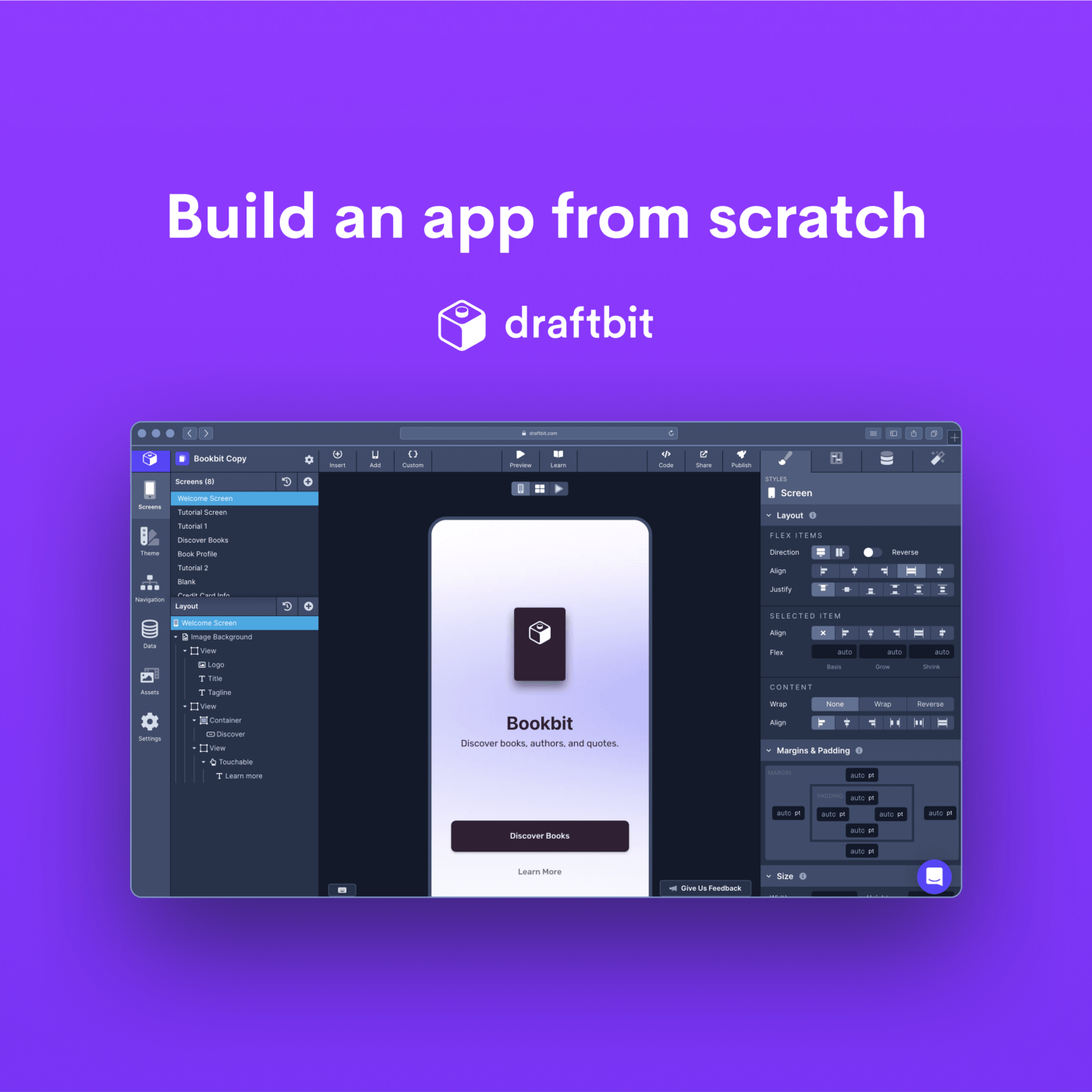
We have a new and improved tutorial series: Build an Instagram Clone from Scratch. This new series includes a real back-end, authentication, and more complex UXs. If you’d like to continue with the Bookbit tutorial, proceed! If you’d like to check out the Instagram Clone series, head over here.
Like React Native, Draftbit Builder uses the Flexbox algorithm to specify the layout of an app screen. The algorithm provides consistency among different screen sizes. With this tutorial’s help, let’s learn step-by-step how to create a user interface using the Draftbit app builder and see in action how Flexbox layout components are configured and understand the building blocks of the Builder. For the current example, we will be building a welcome screen for the Bookbit app.
Creating React Native applications gives the ability to generate one source code for multiple mobile platforms such as iOS and Android. Over the years, the developer experience of building such apps using the framework has improved with the introduction of features like Hot Reloading and Fast Refresh.
Taking advantage of these features, at Draftbit, we aim to provide a better developer experience for software developers and designers alike. Draftbit is a no-code/low-code app builder used to build working prototypes of mobile applications exported to React Native.
Here are two screens we are going to build in this post:
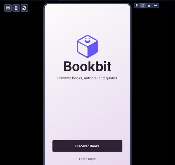
Welcome Screen
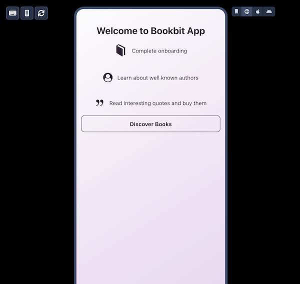
Tutorial Screen
The concepts covered in the post are entirely oriented towards the Draftbit Builder and are as follows:
- How to create a new app in the Draftbit Builder
- Understanding the elements to create a screen in Draftbit Builder, such as what does left, center, and right panels are for
- How to rename a component and re-arrange their order using the drag-and-drop feature
- How to use an Image Background component
- How to use an Image component
- Add a component from Bits
- How to configure a text component and use Draftbit’s built-in typography elements
- How to create a button with a solid background
- How to create a borderless button using a Link component
- How to create custom blocks of different components to re-use them
- How to use components like Icon
- How to create a button with an outline
- How to preview an app generated with Expo
How to create a new app in Draftbit Builder
Before we start, make sure you are logged-in your Draftbit account. After logging in, you will be welcomed by a similar Dashboard screen as shown below:
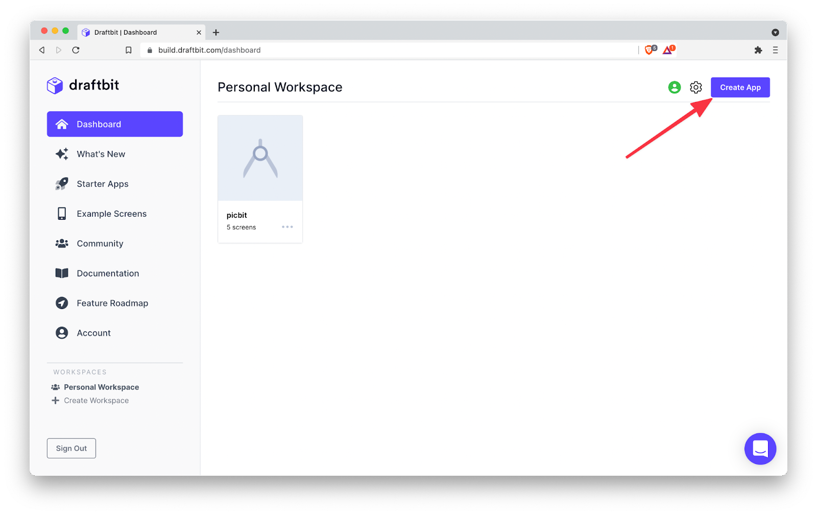
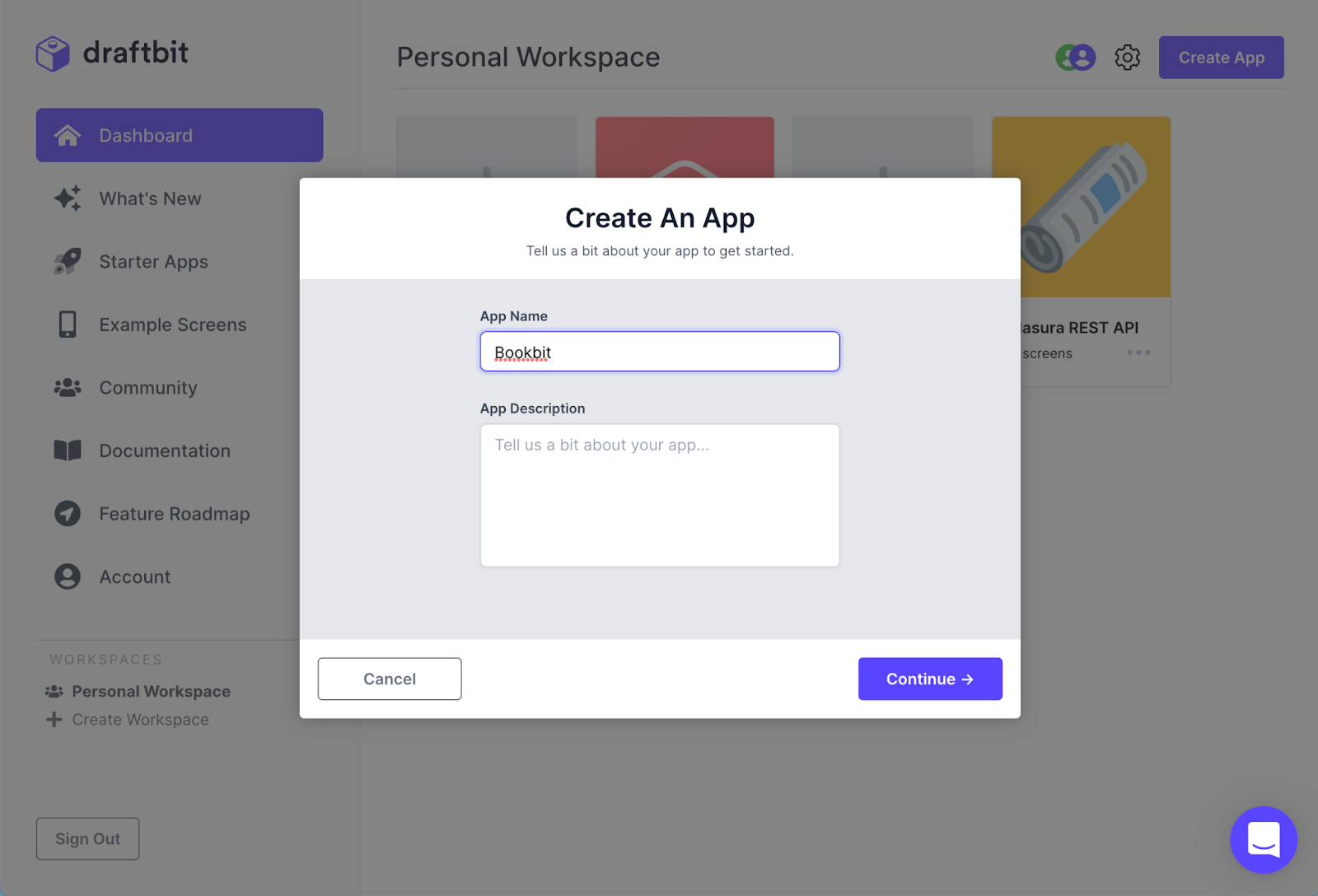
To instantiate a new app in the Draftbit Builder, click the button ‘Create App’ on the screen’s right top corner. After clicking the button, fill in the necessary details of the app prototype as per your needs. It’s a four-step process:
- In the modal form, enter the name of the app prototype under ‘App Name’.
- Enter the ‘App Description’ for the app prototype and press ‘Continue’.
- Select a template. Since we are building from scratch, let’s start with a blank app. Click the button ‘Start with blank app’ at the bottom center of the modal form and then press ‘Continue’. There are tons of layouts for various purposes available in the Builder that you can choose.
- It will notify you that the Builder is ready, and you can start by pressing the button ‘Start Building’.
Here is the overview of instantiating a new app:
Understanding the elements to create a screen in Draftbit Builder
The left Panel
Once this new app is instantiated, the Draftbit Builder welcomes you with a blank screen named Blank with no React Native components represented. The advantage of using a blank screen is that you can build the user interface from scratch.
You will see that the ‘Screens’ section is currently selected on the side panel on the left side. Every screen created in the Builder falls under this section. This section is further divided into two sub-sections or panels: Screens and Components
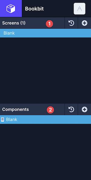
The ‘Screens(1)’ shows the number of existing screens in the app, currently one since there is only one screen. The ‘LaComponentsyout’ is where you can add React Native components to configure and structure the user interface for a particular screen. Since the first screen is already created for us, let’s rename it.
Rename a screen
To rename a screen in the Draftbit Builder you will have to follow the following steps:
-
Select the screen
-
Double click it and enter the name of the screen
-
Draftbit Builder will take care of updating it automatically.
To verify that the screen name is updated, you can click the “Export Code” button to View Code in the top panel, and the component screen we just renamed reflects there.
Here is the code snippet for your reference:
import React from ‘react’;
import { ScreenContainer } from ‘@draftbit/ui’;
const WelcomeScreen = props =>
return
};
export default WelcomeScreen;
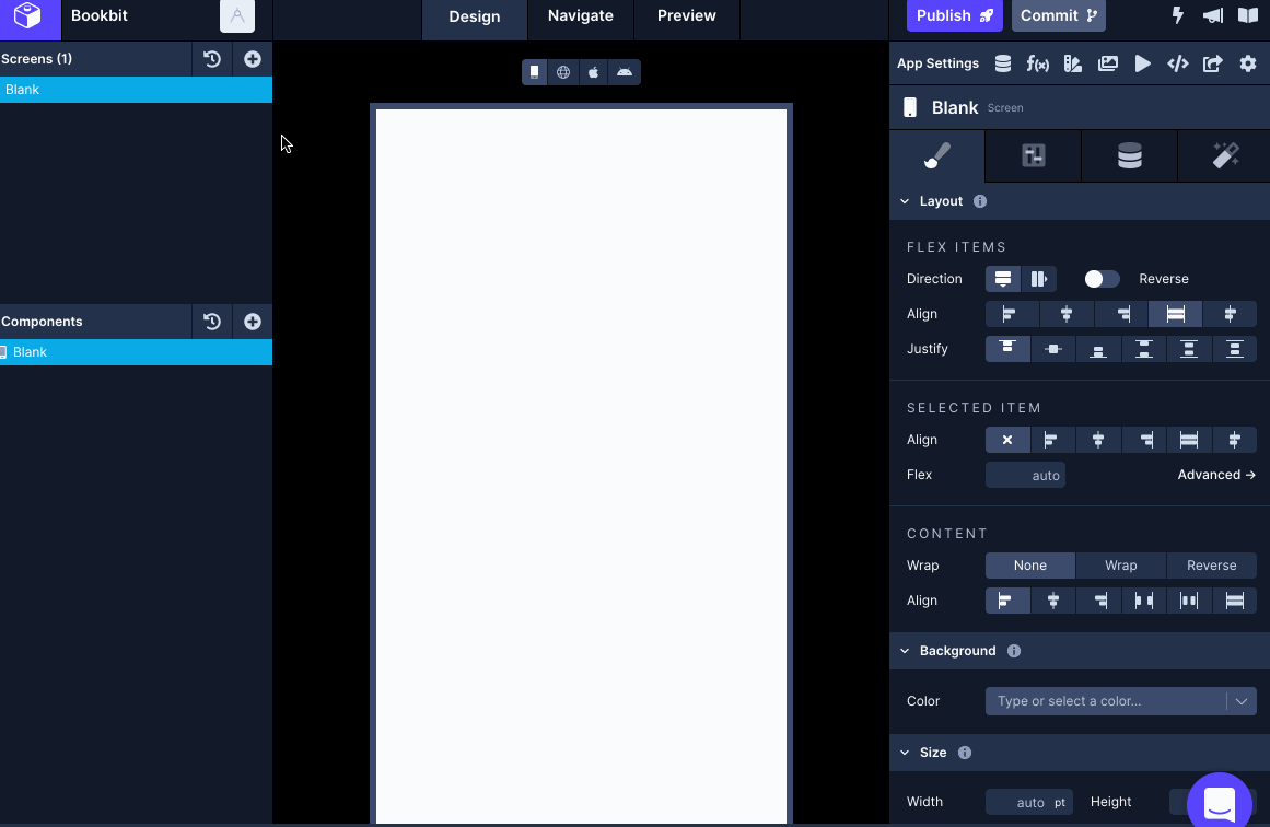
The right panel
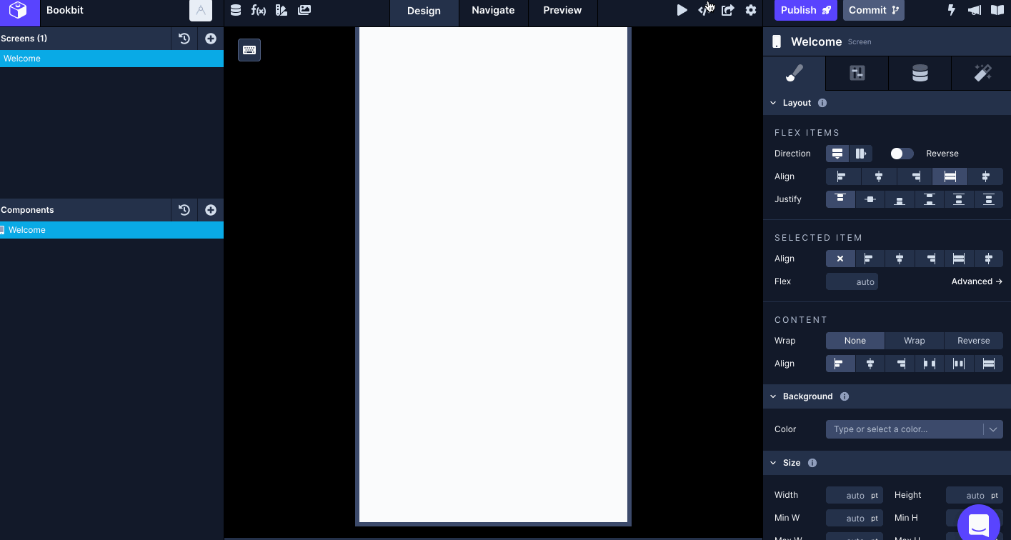
Also known as the Properties Panel, it is used to configure each Component’s properties that are representing some part of the UI on the screen. It is divided into four tabs:
- Styles is where the definition or modification of a layout component is handled.
- Configs are where the configuration of the layout component is handled. For example, you can rename a component.
- Data is where data consumption in real-time from a REST API is consumed or is used to provide a value for a component such as Text.
- Interactions are where different kind of relationships between components and screens is handled. For example, you can control navigation from one screen to another on the Touchable component.
We will cover all of these tabs in later posts in-detail but for this post, let’s keep the majority of the focus on Styles and Configs tabs.
Creating the first screen
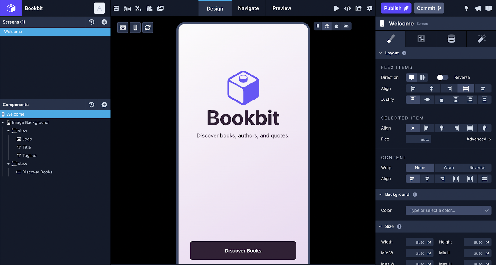
The first screen we are going to create is called the Welcome screen. It is going to have the following structure of React Native components.
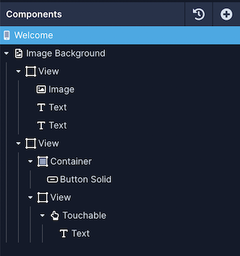
The first component that we are going to add is called ImageBackground. It provides a feature to add a background image on a screen component. To add it:
- Click the plus icon button in the Builder.
- Under the Media components bits, click the Image Background components. When adding an image as a background image or just to use it in an Image component, always make sure that the file name you are uploading begins with a letter instead of a number.
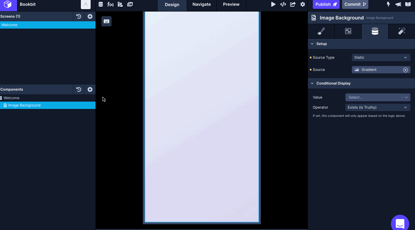
The Image Background component requires a background image. The Builder allows you to upload a custom image as the source for this component:
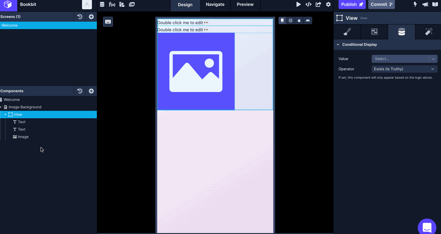
- Select the Image Background component from the left panel.
- Select the Data tab in the Properties panel.
- Set the Source Type to Static and select the Image uploaded for the Source.
- In the modal, you can choose to upload a custom background image and then select it. It will be used as the source of the Image Background component.
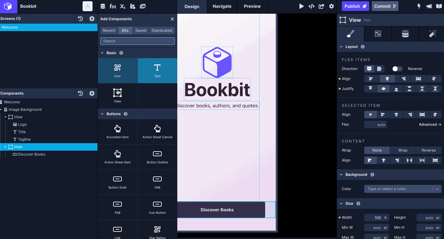
The element we will represent is a container that contains a logo composed of an Image component, a title, and a tagline, both composed from a Text component.
- Click the plus icon button in the Builder.
- Select the View and Text from Basic components to add. This set of components is the basic block of building a screen.
- Select the Image from Media components to add. These components help further define the structure and UI of a screen.
We want to display the title and tagline below the logo. You can drag-and-drop to re-arrange the order of components for a particular screen as shown below:
Let’s modify the styles for these components.
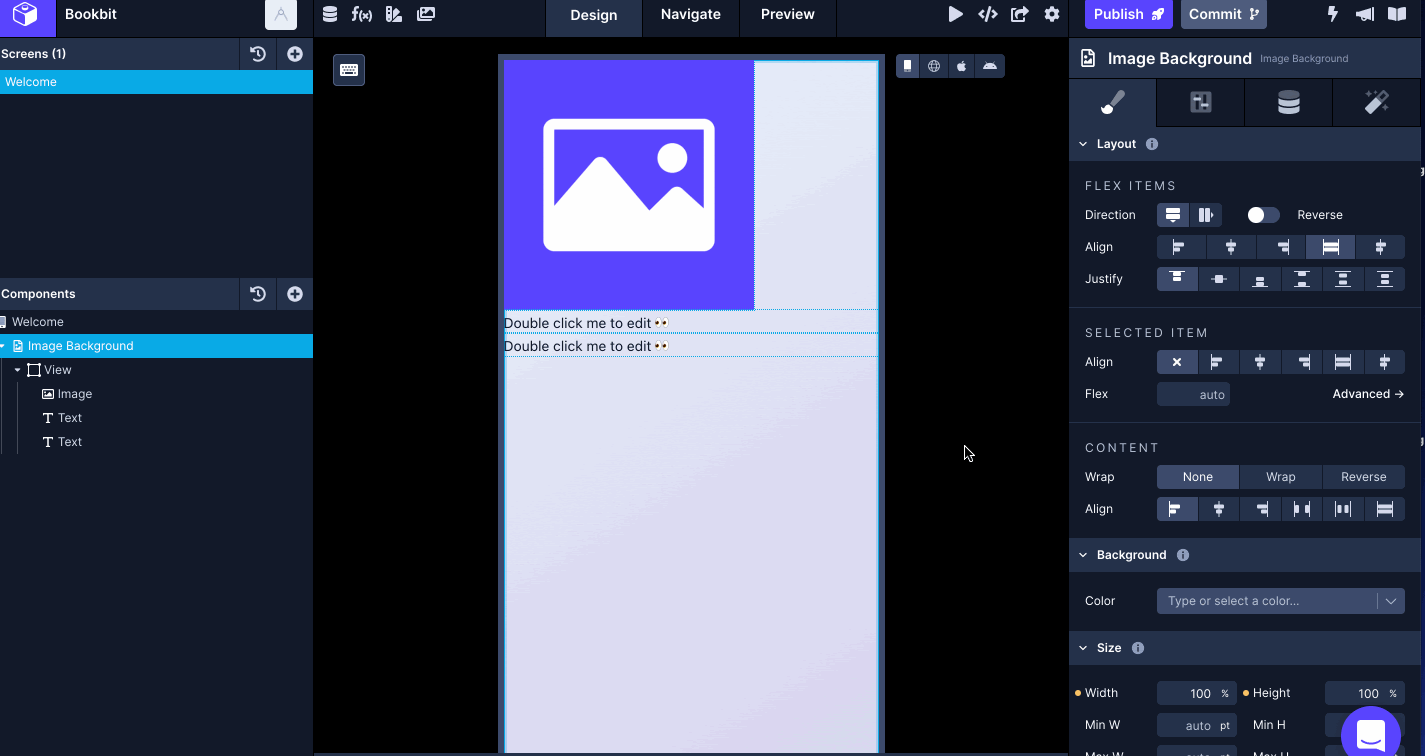
- Select Image Background and set the value of Align and Justify to center under Flex Items. This section is used to align the position of a component using the Flexbox algorithm. A component here can either be the child of it or can be self-aligned.
- Then, add a value of 1 to Sizing > Grow. It defines the flex item’s ability (in this case, the Image Background component) to grow based on the screen size if necessary.
- Then, in the Margins & Padding add a bottom padding of 40pt. The default value for either margin or padding is 0pt. The values can also be defined in % in the Builder wherever necessary.
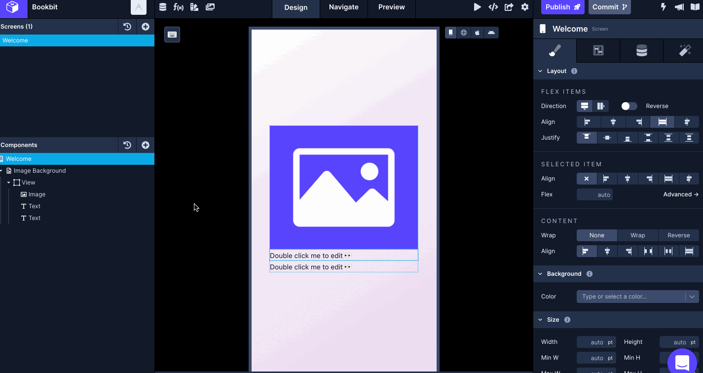
- Select View, and in the Styles tab, set the value of Align to center under Flex Items.
- Then, in the Margins & Padding add a bottom margin of 120.
- Select Image. In the Styles tab, add a bottom margin of 4. Under the Size, add a width of 140 and a height of 150.
- Then, go to the Data tab, and in Image source upload an image to represent the logo.
- Lastly, go to the Configs tab, double click the Image component to rename it to Logo.
A Text component can use Draftbit’s built-in typography elements. These typography elements are composed of Font and Color. There are pre-defined typography values ready to use.
- Rename the first Text component to Title and the second one to Tagline.
- Set styles for Title in the right panel. Select Headline1 font. It comes with custom values for Size, Letter Spacing, Line Height, and Color.
- To change the color, select the Color Picker. There are predefined color values you can choose. For the Headline1 font, the color value of strong is chosen from the default theme. You can also add custom HEX or RGBA values to set the color for a property.
- Go to the Data tab and add the Title element’s value to represent the Text property.
- Similarly, for Tagline select the font Subtitle1.
- Add a top margin of 4.
- Then, add the Text value in the Data tab.
In the original layout of this screen we are building, there is another View component used to wrap two buttons. It is the child element of Image Background and not the previous View component that we have been working on so far. Let’s create the first button with a solid background.
- Select the Image Background, click the plus icon button, and then click View.
- Set horizontal padding for this to 34.
- Set a Width of 100%.
- In the left panel, click the plus button icon, select Blocks and then click Button Solid.
- Change the value of property Text in the Data tab to Discover Books.
- Go to the Configs tab and the value for the Component name property to Discover Books. It is another way to rename a component.
- Change the value of the Color Override property to a custom hex value of #332036. It represents the solid background color of the button component. Once you add a custom value for the color, it can be re-used and is shown in the Recent section in the color picker.
- To change the color value of the label of this button, select the picker for the Label Color Override property and change it to the predefined value of Background which has an actual hex value of #ffffff.
- In the Styles tab, add horizontal padding of 28 and change the value of property Border Radius to Button.
Now, in the same View container, let’s create a borderless button with a Link component.
- Select the parent View container, click the plus button icon to add a child View component. Set the value for Align and Justify under Flex Items to center on the parent View component.
- Add a top margin of 20 to the child View component in the Styles tab.
- Select the newly added View and add a Link component.
- Select the Link component, go to Styles tab, and change the value of Color to Medium under Typography. Medium is one of the color values that comes pre-defined inside Draftbit. You read more about Theme Colors here.
- Lastly, go to the Data tab and add the value of the Text property to Learn more.
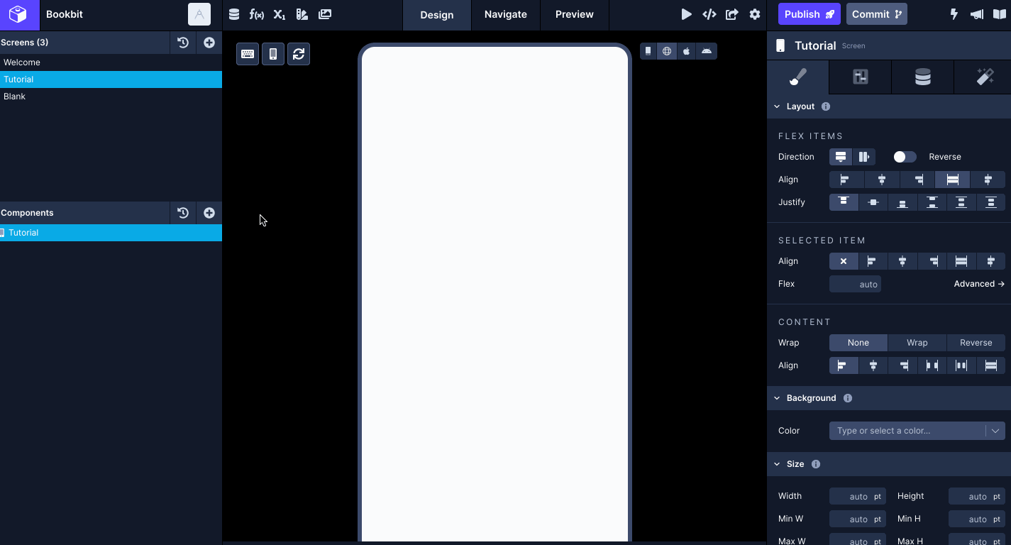
Building the Tutorial Screen
The next screen we will build is called the Tutorial screen. This screen will display some icons and a button. In your Draftbit app:
- Open the Add a screen menu, and add a blank screen.
- Rename the screen to Tutorial.
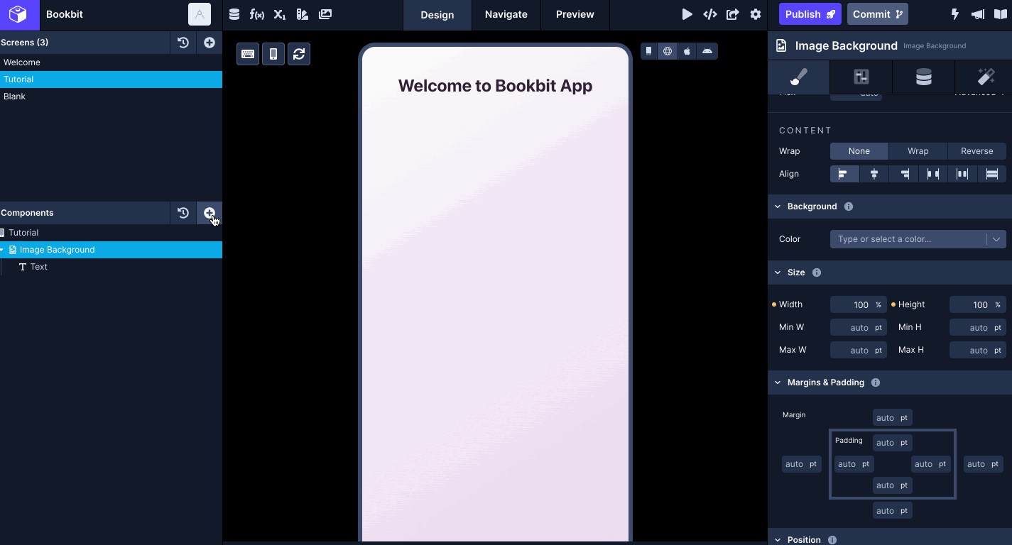
- Select the Tutorial screen in the Components tree and an Image Background component. This component will have the same gradient background that we used in the Welcome screen.
- With the Image Background component selected, select the Data tab in the Properties panel.
- Set the Source Type to Static and select the Image uploaded for the Source.
- In the modal, you can choose to upload a custom background image and then select it. It will be used as the source of the Image Background component.
- Add a nested Text component in the Image Background that will serve as the title of the screen.
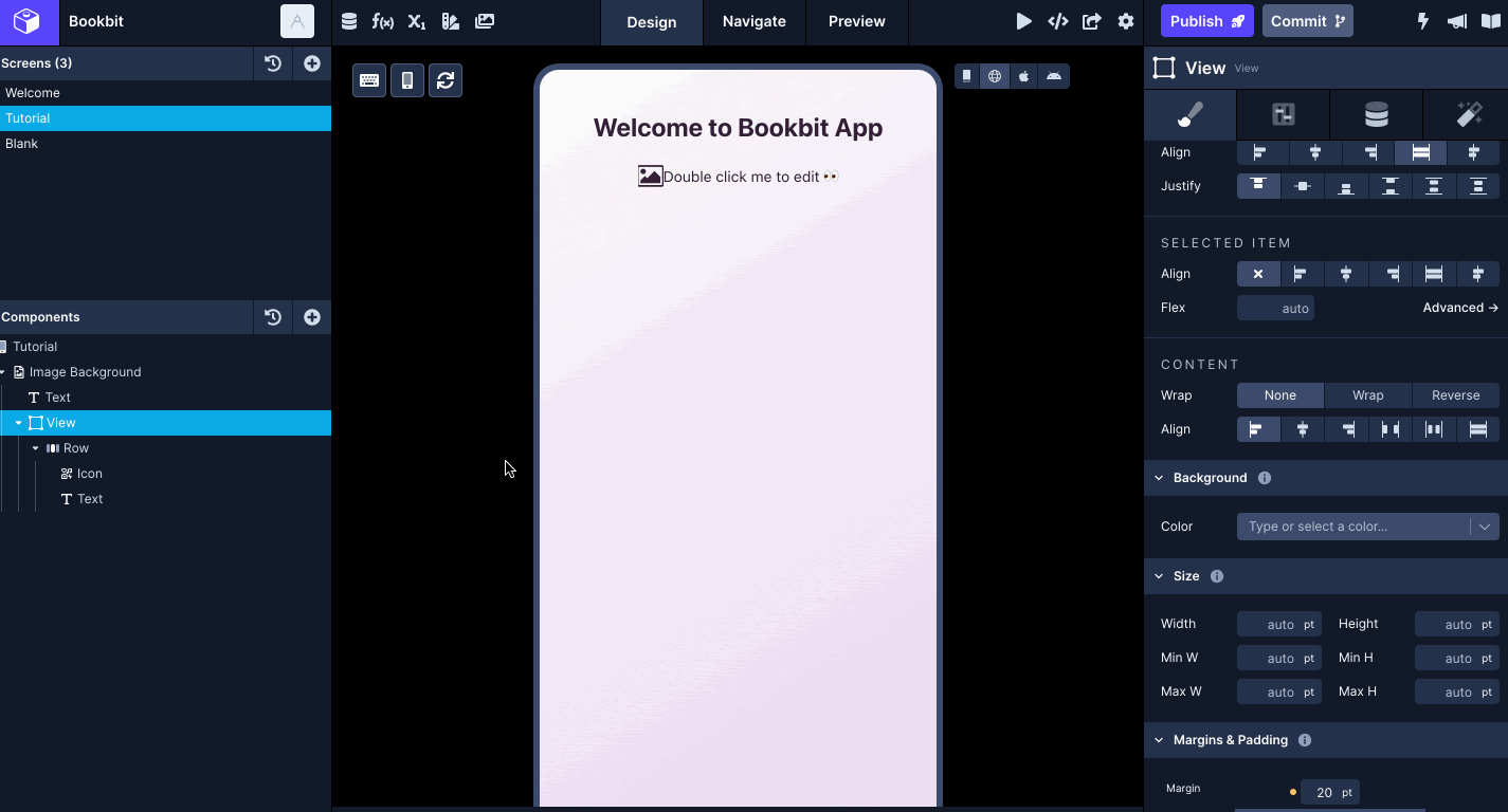
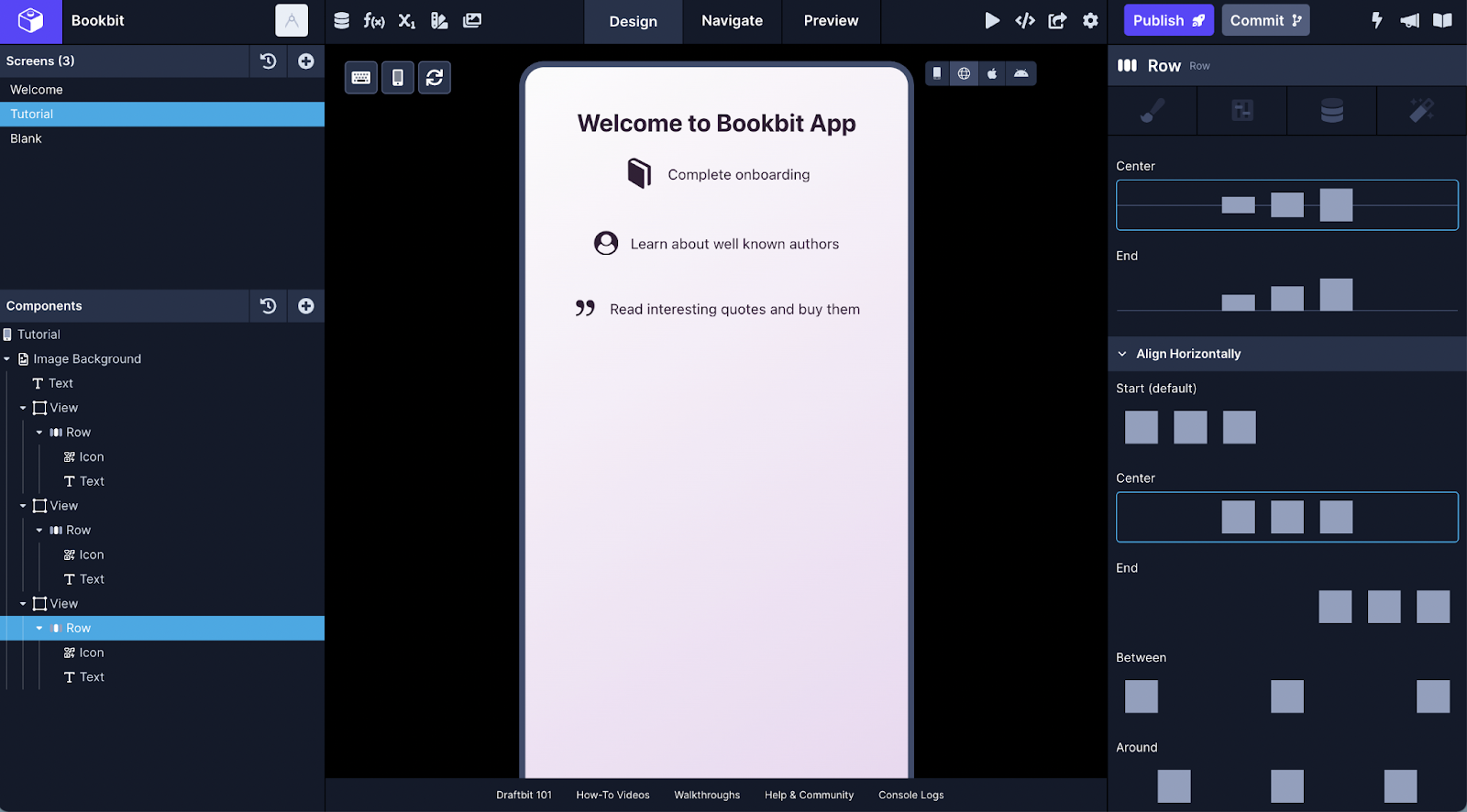
Below the title, we will create three rows where each row will contain an icon and some text.
- Add a View component adjacent to the Text component. Go to the Styles tab, give it a margin-top of 20 and margin-bottom of 20.
- Add a Row component nested inside the View. From the Properties panel, under Align Horizontally, select Center.
- Inside the Row, add Icon and Text.
Using Save Custom Block
Creating a layout for different screens in the Builder, you will often find yourself repeating the same patterns using the same set of components. An advantage Builder gives here is to re-use them by creating custom blocks for a set of components that are visually similar. You can use these custom blocks either on the same screen or in different ones and customize the information.
Let’s take the example of the Tutorial screen. Repeating the steps from adding a View, Row, etc. two more times can be tedious. A good way to repeat the layout of components is to save a specific component tree as a Custom Block.
- Hover over the View component in the Components tree.
- Open the ellipsis menu (…), and click Save Custom Block. Add a name in the input field and then click save.
- Then, click the + icon to open the components drawer, and go to Saved tab. This is where you will find all the saved custom components.
Adding an Icon
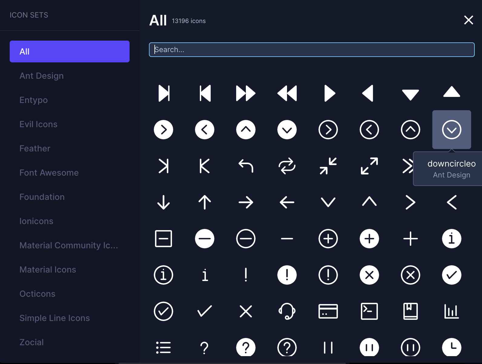
In the right panel under the Configs tab, you can add or modify an icon by its name, color, and size.
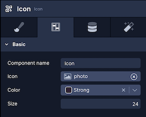
The property Name defines the icon. Draftbit supports various icon sets such as Ionicons, Ant Design, Material icons, Font Awesome, etc.
Here is the output after adding icons to the Icon components:
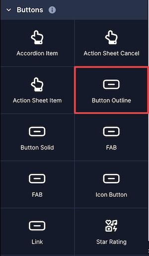
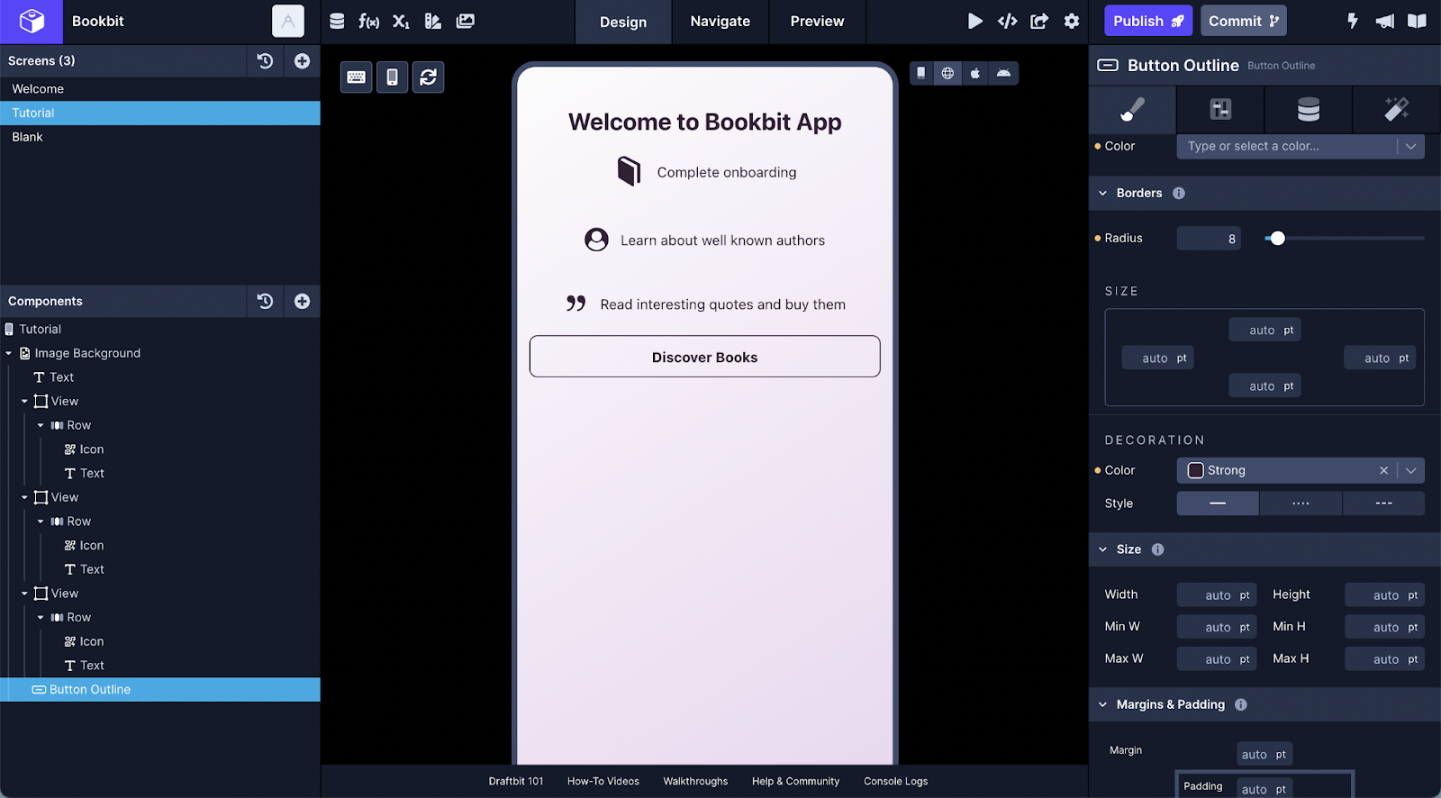
How to create a button with an outline
There are different types of button components currently supported in the Builder. The two most common to use button components are Button Solid and Button Outline. Earlier, we have seen how to use and configure a Button Solid component when creating the Welcome screen. The Button Outline works in the same way. You can add it from Bits > Buttons panel.
Unlike the Button Solid component, it does not have a solid colored background.
On the Tutorial screen, let’s add a Button Outline to navigate (in future) to the next screen.
Preview the screen
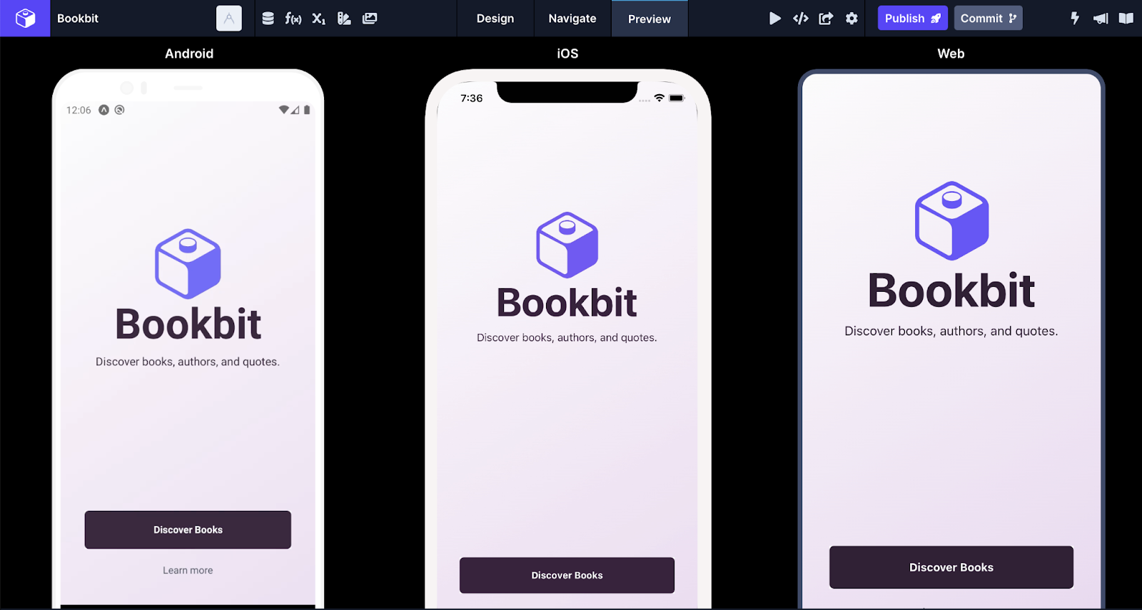
The Draftbit Builder allows you to Preview a screen in two ways. The first way is to use the Preview mode in the Builder itself. It has three views: Web, iOS, and Android. To open it, click the Preview button in the top panel.
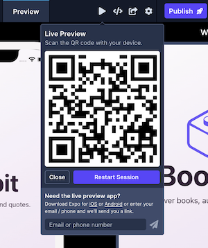
The second way to preview a screen is to use Live Preview on a real device by scanning the QR code using the Expo Go app.
Conclusion
It has been a long one, we know, but the objective of this tutorial was to make you familiarize with the panels and properties that Draftbit exposes you to build User Interfaces.
Here are some links to help you out:
- Draftbit documentation on Layout properties which provides an overview of all the available properties related to Flexbox.
- If you want to understand or get familiarize with Flexbox check our guide on React Native Flexbox Layout using Draftbit’s Visual Builder.
- Check out more tutorials on building mobile apps from scratch using Draftbit.
💜 We at Draftbit love our Community and are always open for your questions, feedback and feature requests. You will also find more resources to learn and build with Draftbit.
Reach out to us on twitter/@draftbit for more questions.