
The Complete Guide to React Native Flexbox Layout using Draftbit’s Visual Builder
How Draftbit uses React Native's Flexbox layout to build apps visually.
In a React Native app, the Flexbox algorithm is used to specify the layout of a component and its children. The algorithm itself is designed to provide consistency among different screen sizes. In this tutorial, I am going to introduce you to how to use various Flexbox properties to create different layout patterns using Draftbit.
What is Draftbit?
Draftbit is a visual builder for creating React Native apps. It makes creating layouts using Flexbox easier and faster than hand-coding them.
With a Draftbit account, you can build unlimited Flexbox layouts and export the screen code (all for free, no credit card required).
Building Flexbox Layouts in Draftbit
I am going to use a Blank screen template to start with that is going to wrap two components. The first child component is going to be the Text of what the example is about, and the second is going to be a View component. In this View component, you are going to see examples of different Flexbox layout properties.
An example of the template used in this tutorial with a Text and a View component. This screen is going to be modified throughout this tutorial.
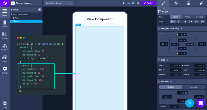
The goal of this post is to give you an overview of how you can leverage the tooling provided in the Draftbit build tool. For a quick reference, all the layout properties used can be referred to in the Properties panel on the right side.
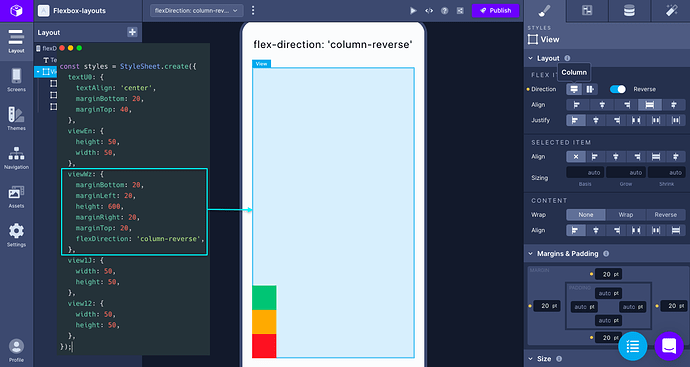
The flexDirection property
The
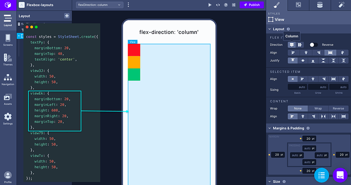
The
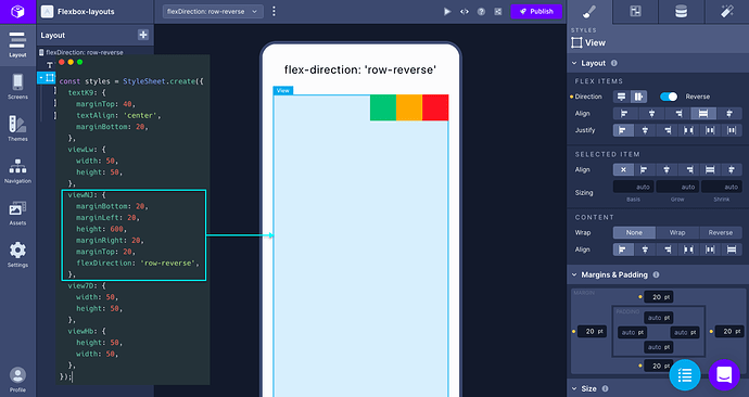
Similarly,
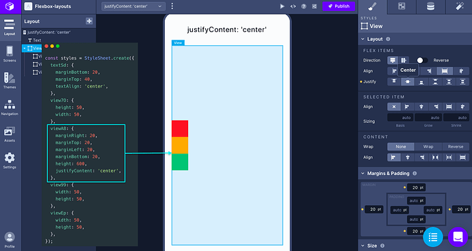
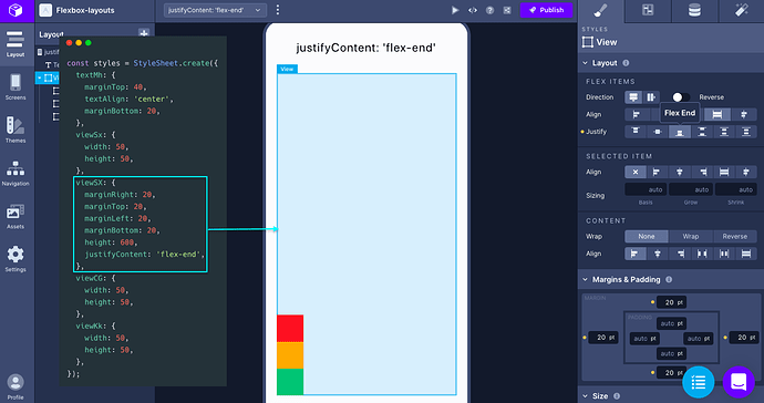
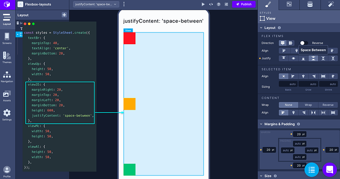
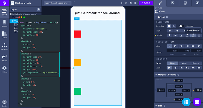
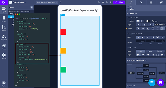
The justifyContent property
The
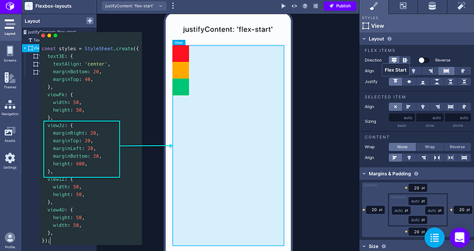
To change the value of this property, let’s say to align all the children component at the center of the main axis, you have to change the value of Justify property under Flex Items:
You can set the value to
Setting the value to
Setting the value to
The last property value is
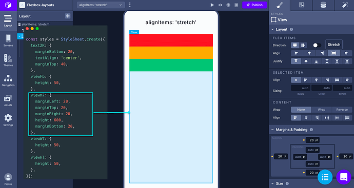
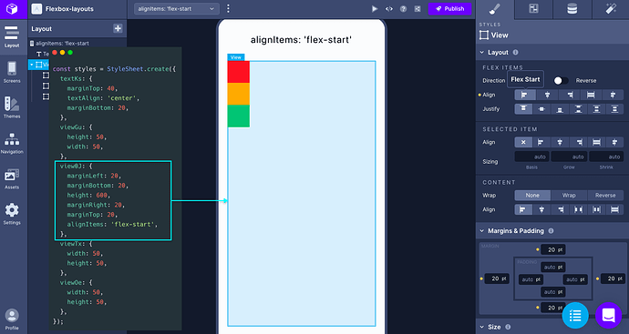
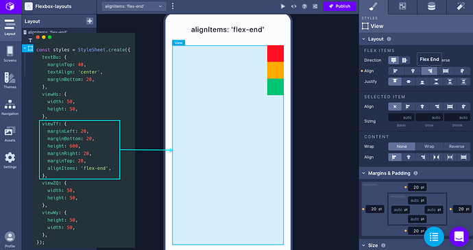
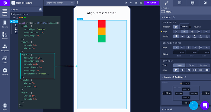
The alignItems property
The value of
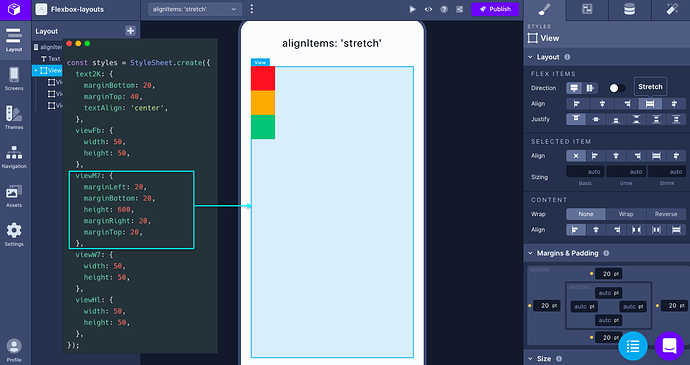
The children component must not have a fixed
The value
The value
The value
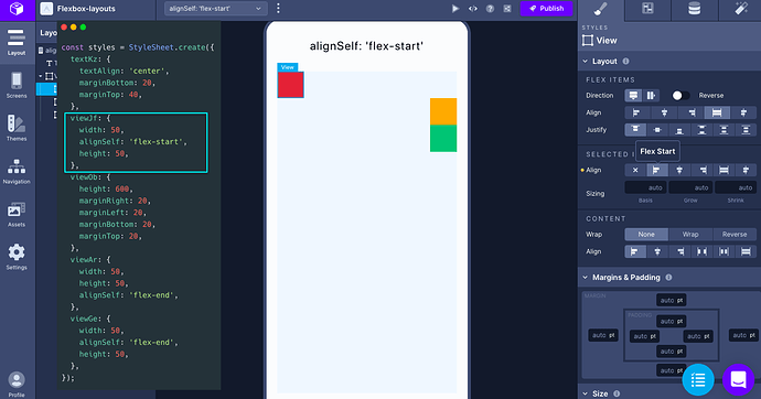
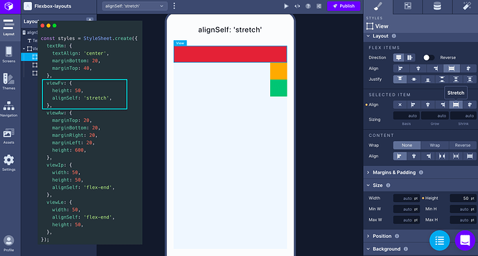
The alignSelf property
The value of the
For example, when the value of alignItems of the parent component is set to
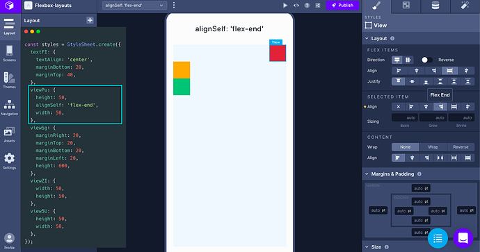
Similarly, when the parent component has the value of
Setting the value to center for the child component is going to have the following effect:
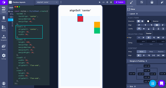
On removing the fixed width dimension of the first child component and setting the value to
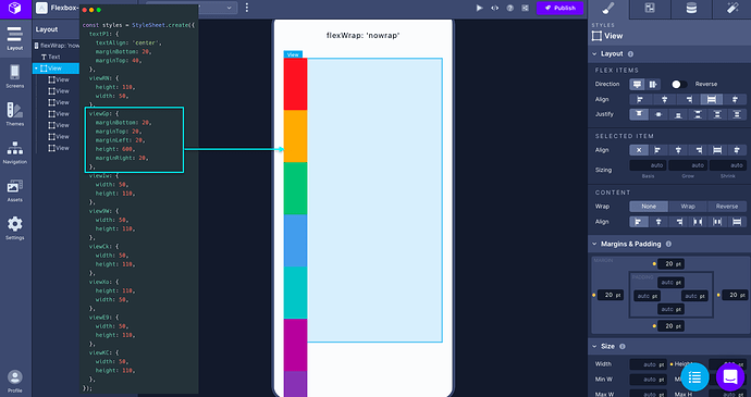
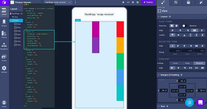
The flexWrap property
The
The default value of this property is
The other two values are
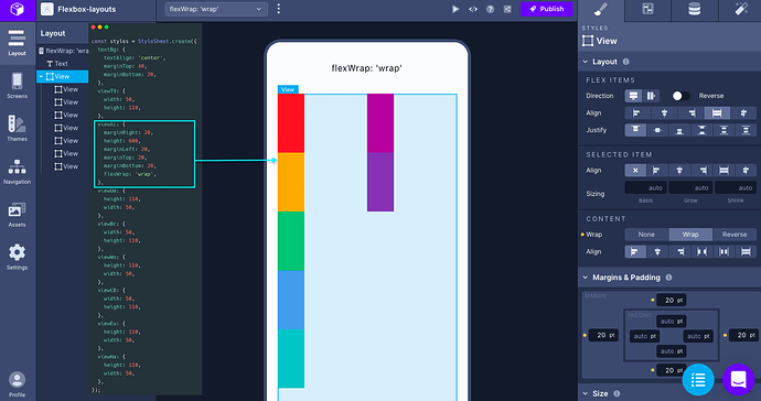
And the
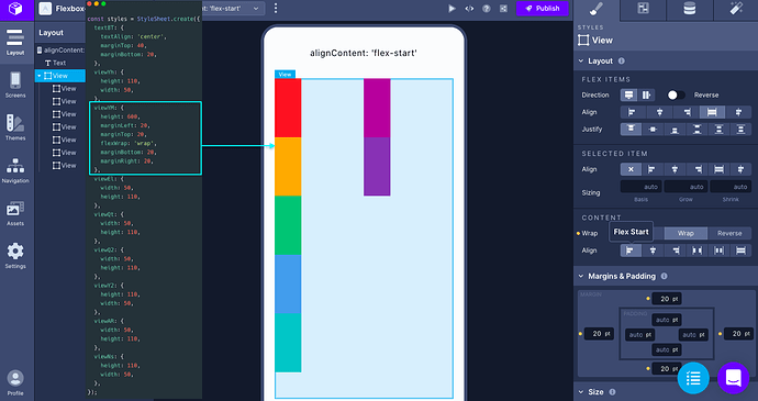
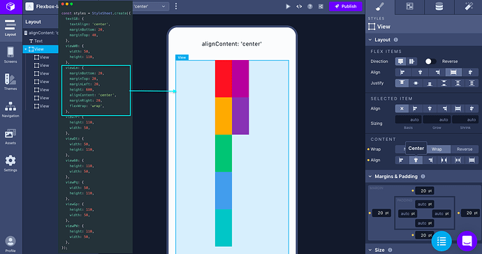
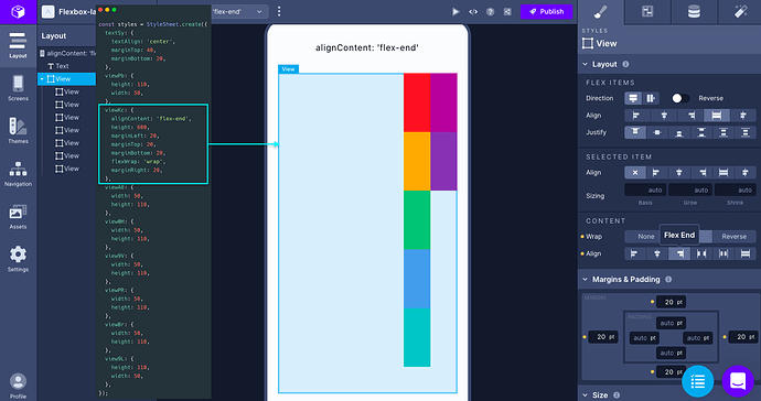
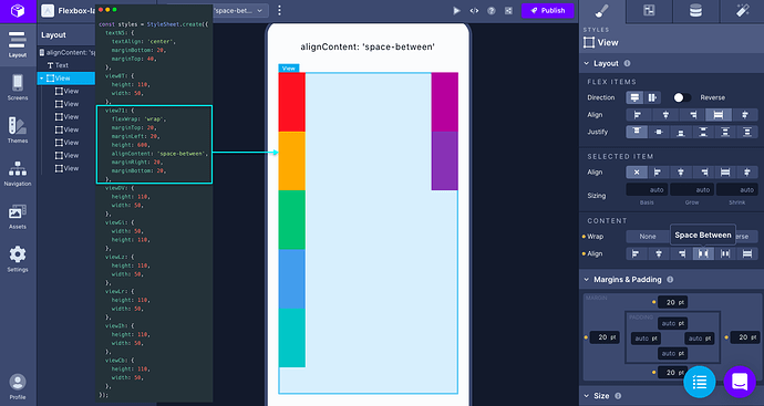
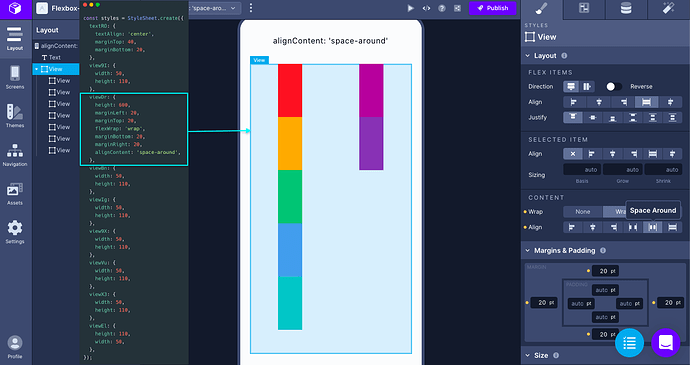
The alignContent property
The
The second value aligns the wrapped lines in the center of the parent component’s secondary axis.
The value
The
The
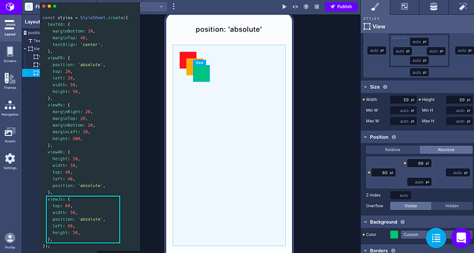
The position absolute
The property
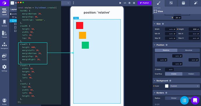
The
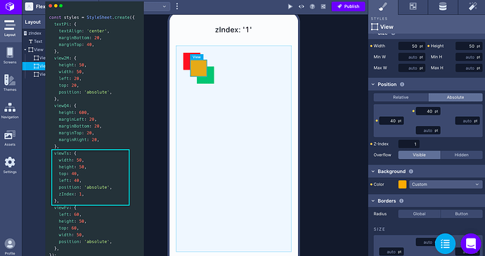
The zIndex property
This property can control which child component to be displayed on top of its siblings. In the example below, the second child component is displayed on top of the first and the third sibling. The value to control the position is determined by setting the
To change the value of zIndex, go to the right panel, and under the property Position you will find the Z-Index field, as shown in the example below.
Conclusion
After completing this tutorial, you’ve got the overview of how to use Flexbox layout elements when building UI components using Draftbit.
Here are some links to help you out:
- Draftbit documentation on Layout properties which provides an overview of all the available properties related to Flexbox.
- The official Yoga Layout documentation and its playground.
- More information about
position property at MDN web docs. - React Native official documentation on different Layout properties.
- For Flexbox Layout patterns, this post refers to The Full React Native Layout Cheat Sheet.
- Check out more tutorials on building mobile apps from scratch using Draftbit.
💜 We at Draftbit love our Community and are always open for your questions, feedback and feature requests. You will also find more resources to learn and build with Draftbit.
Reach out to us on twitter/@draftbit for more questions.